Welcome back to another Carrington House Renovation!
If you haven’t checked out Room 1 and Room 2 jump over to our website now to read all about how we transformed those amazing spaces that blow you away!
Now for today, it’s living room time! Without a doubt, this is by far the hardest renovation yet, with lots of ups and downs and challenges throughout the process.
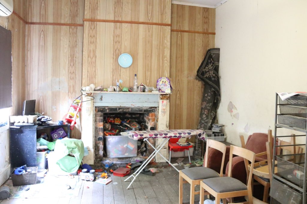
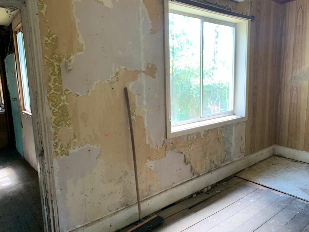
From finding a swamp in the flooring to a slanted fireplace and walls that were falling apart we transformed this living room into an intricate and beautiful space with muted neutrals, textures, and layers
A special shout out to; Ferris Buildings, Hunter Lining Project, Pachira Tile, and Cemintel for making this renovation happen
Read all about our living room transformation journey on how we renovated this space from this…
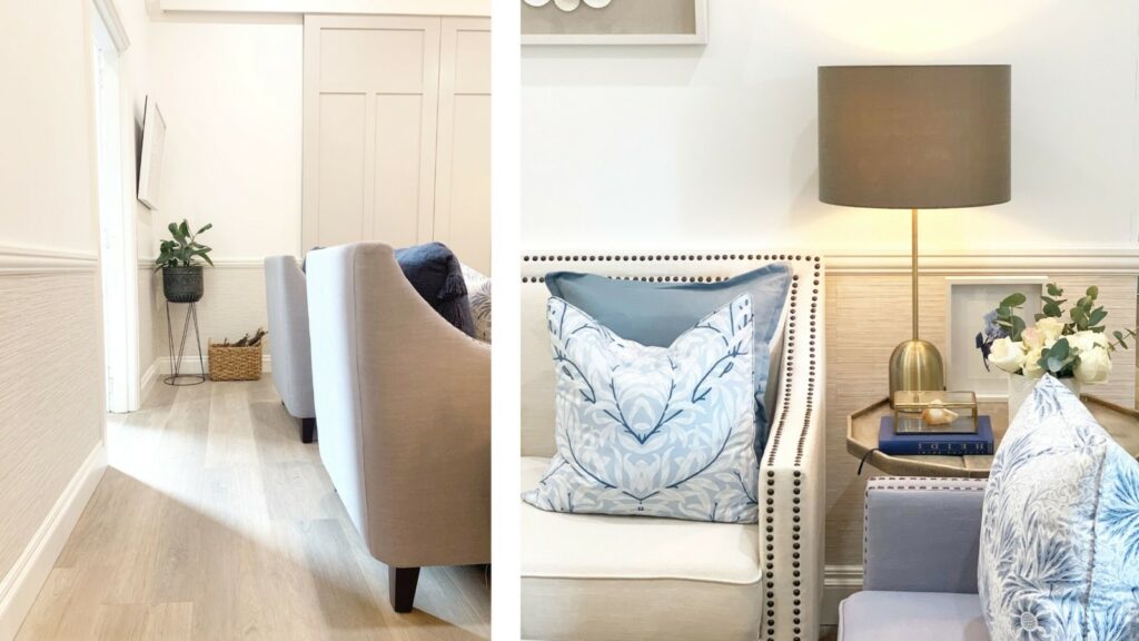
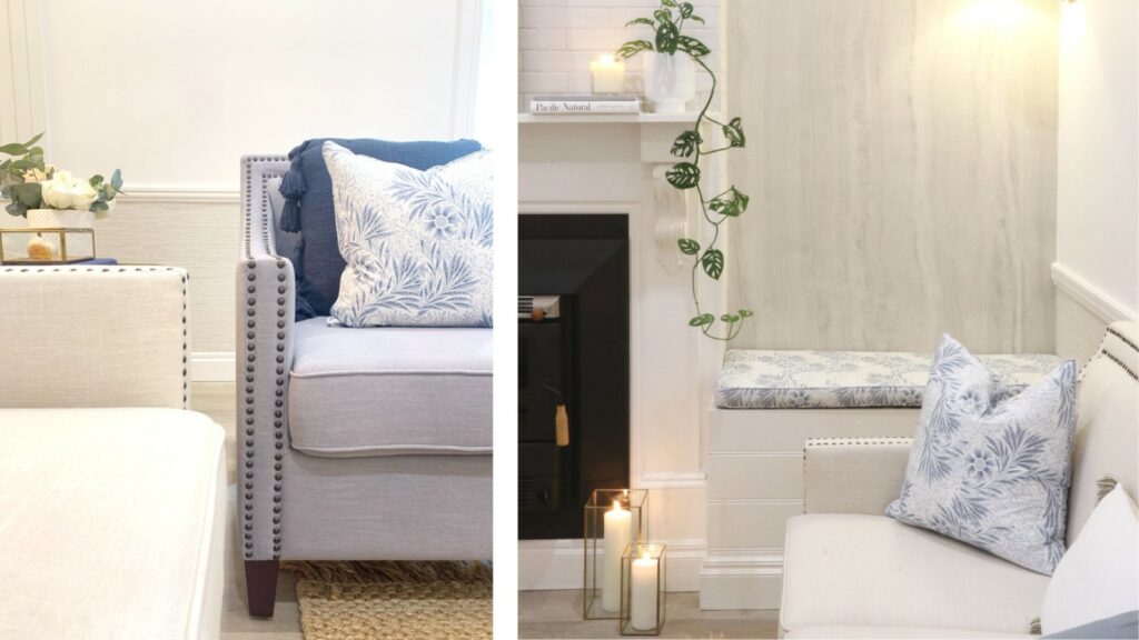
… to this
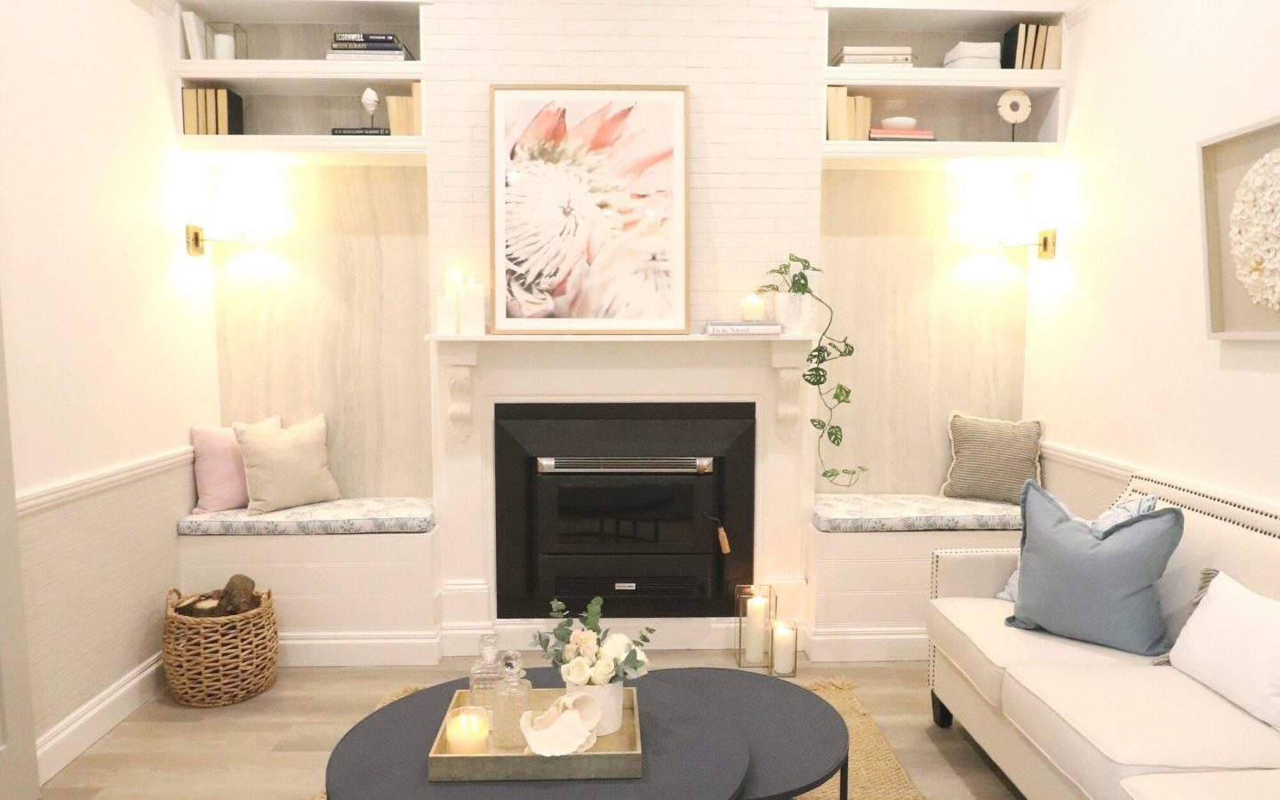
However, if you prefer to watch simply click the videos below…
So How Did We Pull Off This Renovation?
DEMO
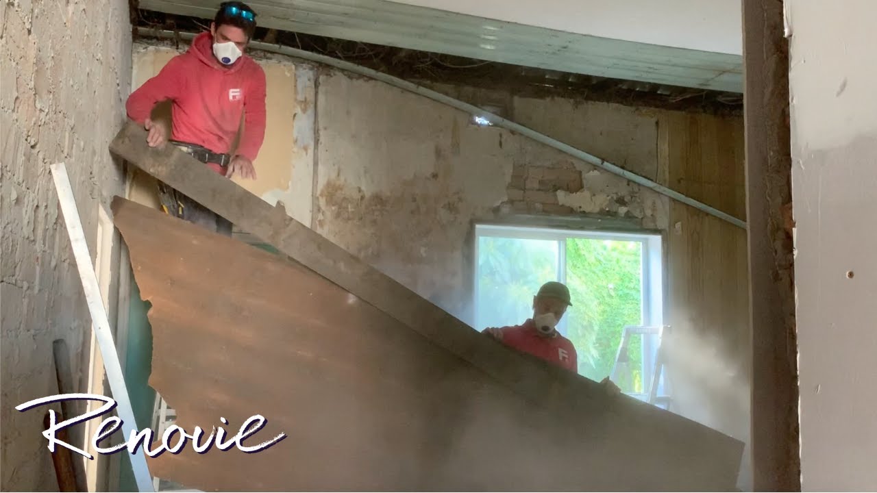
After months of being haunting by the fireplace, it’s time to start demoing the room!
We had the team from Ferris Buildings to help us start by removing the original floorboard in the room. However, to not to our surprise again, we found a swamp at the bottom of our floor (damn the floors)
It was now time for the team to lay the giant LDLs to get this floor down, adding the particle ward we saved earlier back onto the flooring. Then came time to tackle the walls and ceilings and the removal of the window.
WALLS
We had the boys from Hunter Lining Projects come back and install the super tech walls for our living room
A few of you might be wondering what is the difference between Gyproc and Super Check?
So just like Gyprock, Super Check goes on our walls as well!
But the key difference is the acoustic quality of SuperCheck has great sound dampening properties, so it reduces the amount of noise that gets transmitted from one room to the next. This means all the sound transfer from all those meetings, drinks, and game nights that are held in this tiny space will be canceled. Another huge reason for using SuperCheck is because it’s three times tougher – meaning better durability and impact resistance.
To provide continuity and a really cohesive design to space, we continue the same moldings throughout the spaces in the front two rooms. So, we added gorgeous in trim skirting, board door trims, picture rails, and chair rails to continue around the space.
Similar to room 1 and 2 these were adhering to the walls with an adhesive as well as assume that little mouse.
CELINGs
It’s time to add the jewels into this room – the cornices
With Hunter Lining Projects, all men were on deck!
These guys are not only heavy but they are truly an artesian art to hang. We then went ahead and added celling rows to help echo the recurring lines from the cornices. This helped give the ceilings a really simplistic yet timeless and classy without taking drawing away the attention from the beautiful cornices
We then had Dan from Newy Paint Crew come in again to help tape up, gap, and spray paint the walls
DOORS
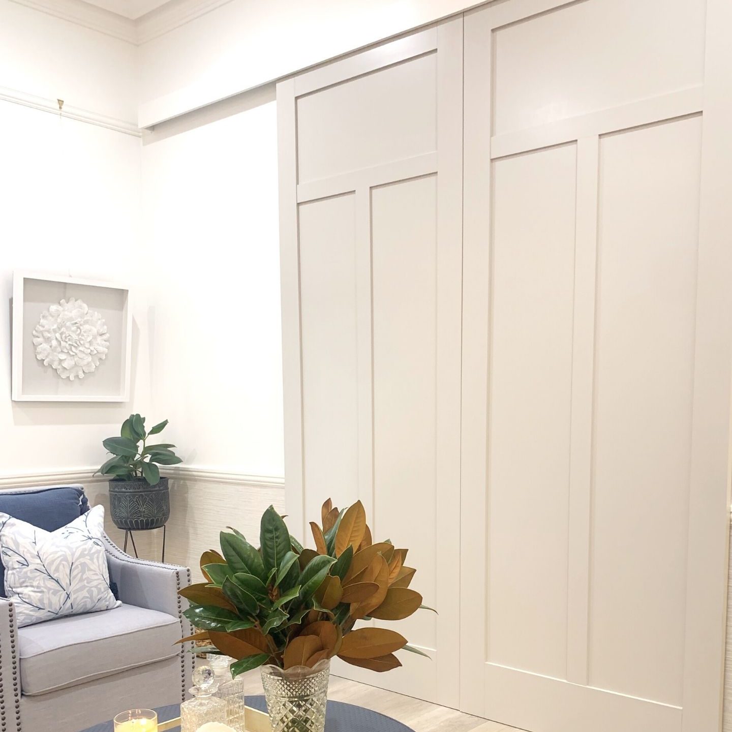
Moving on to the much talked about super-sized doors we created the opening during the demo before
Waiting for the arrival of the doors, we framed and block up the space ready for the doors to be installed. We ordered these gorgeous and massive custom-made doors from Hume Doors, around a meter wide and approximately 2,700 mills high.
We then had our painters come in to paint them in this beautiful neutral semi-gloss Taubman’s paint in the colour Abstract
FIREPLACE:
It is time to tackle the ol’ o mighty fireplace
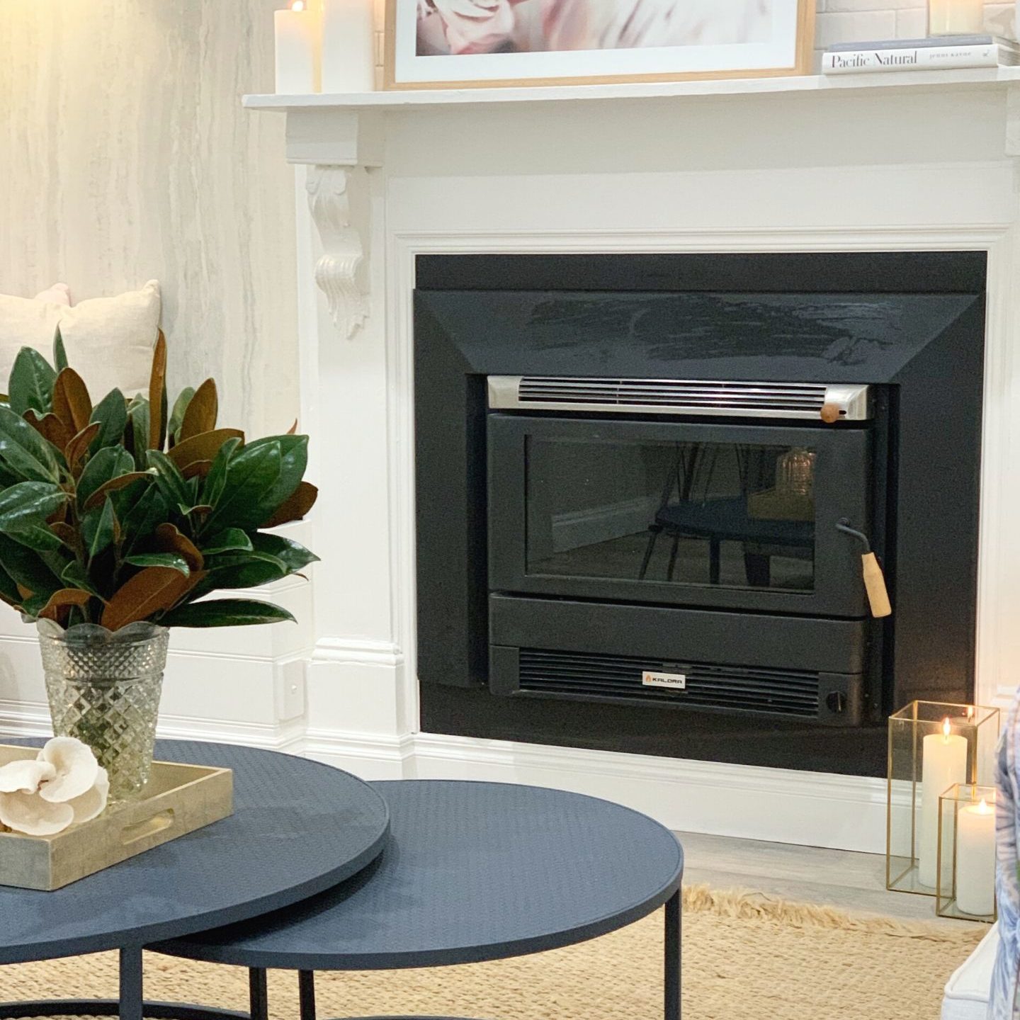
There were endless options and opportunities that we could have done with space. From using it as storage or adding a wooden box inside and painting over it. Funnily enough, we wanted to add a new fireplace to the existing structure. However, there are obviously codes and restrictions that we needed to follow and be approved before
After some careful thought from the team about how to actually make it happen in this really old and decaying fireplace
To give it a place to rest, be secure, and be safe we had to create a fire-retardant surface for it to sit on. Naturally concrete and an FC sheeting frame around the front was the choice to go.
This allowed the Kolera fireplace to slide into it and now to trim it up with some beautiful materials and some paint and the masterpiece will nearly be complete!
BENCH SEAT NOOKS
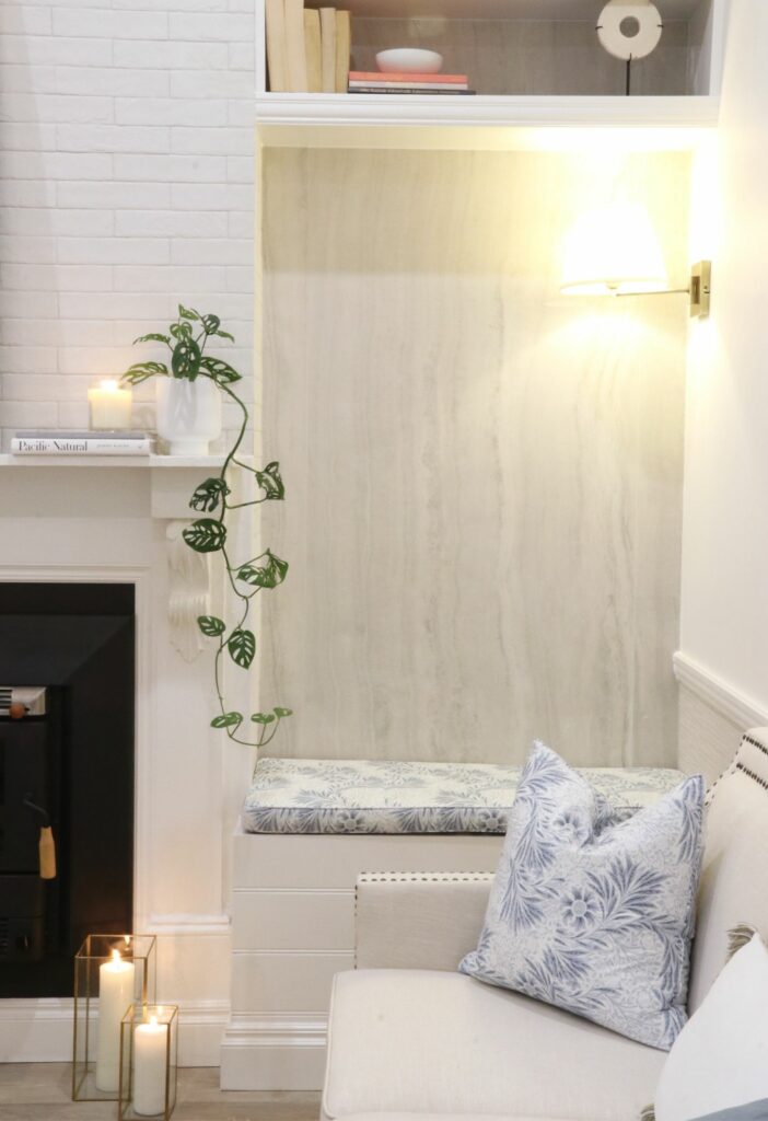
The bench seats on either side of the fireplace were installed purely to increase the seating capacity of the space. It’s not a large living room by modern standards so we wanted to get as much room as possible.
It was then time to add the large format tiles that are placed in the center of the fireplace on either side of the bench walls. With the help of Pachira Tiles, they added these beautiful gloss white onyx finish slab tiles from Beaumont tiles to the walls.
They needed to be cut down to fit the height of the wall and one full slab with a little thin piece on either side
When working with a small floor space but high ceilings, it important to use your vertical surfaces to your advantage. We decided to install some floating wooden bookshelves above the seated nooks, to add more accessible storage for space.
CHIMNEY
With old and rendered bricks we decided to go with added some beautiful white subway tiles to the chimney wall.
With the help of Ferris Building, our tradies helped sealed them, render them and then tile them
LIGHTING
As we took the window out during our demolition, we had to get as much light as we possibly could in this small space.
We installed a feature pendant lighting for the space and added two small feature lighting above the reading nooks at either side of the fireplace.
WALLPAPER AND PAINT
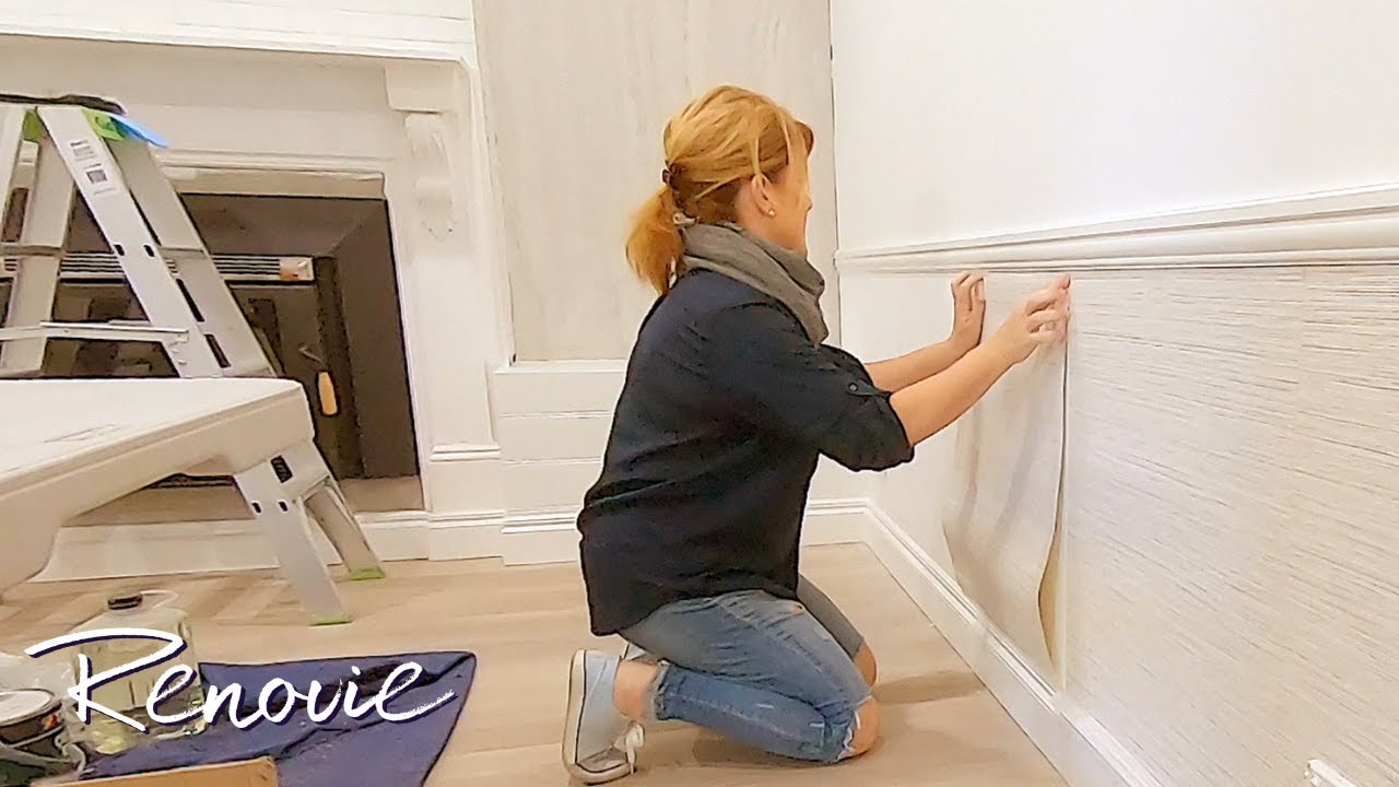
When it came down to choosing our wallpaper, we tried to focus on finding something that will match the two different tiles in the living room.
After considering the space and mimic the light in the room we went with this beautiful grasscloth wallpaper. To help add yet another layer of texture to space, we are placing our wallpaper in between the skirting board and the chair rail
Naturally with wallpapering, we also had paint, so we decided to pull our paint colours from the wallpaper pallet. We decided to go with more neutral tones and colours in the space adding splashes of blue to help tie in the two rooms
STYLING
Last but not least important to any transformation – it’s time to style and dress up the living room.
From walls falling apart, we create a small yet dreamy space by using neutral colours, textures, and layers. We focused on making use of scaling the room, to the big doors and feature lighting to create a space that is functional yet stylish.
And that wraps up our third renovation of the Carrington House – The Living Room Transformation!
Finishes and Products
To get the full list of our finishes and products for this renovation, jump onto our blog to register now!
We like to say a big thank you to our supplier and tradie team!
Find out who helped us made our renovations dream come true…
Supplier Team:
- Beaumont Tiles
- Bristol
- Aslpec
- Gerflor
- Gyprock
- Intrim
- Hume Doors
- Cemintel
- Draperly
- Brosa
- Kalora
- Saddingtons
Tradie Team:
Looking for an easier way to plan your renovation from start to finish?
Make your dream home a reality, no stress, no guesswork with our FREE Beautiful Renovations masterclass CLICK HERE TO JOIN

 Naomi Findlay is an experienced interior designer, project manager and stylist who also loves sharing her passions and experience by teaching others.
Leave a Reply