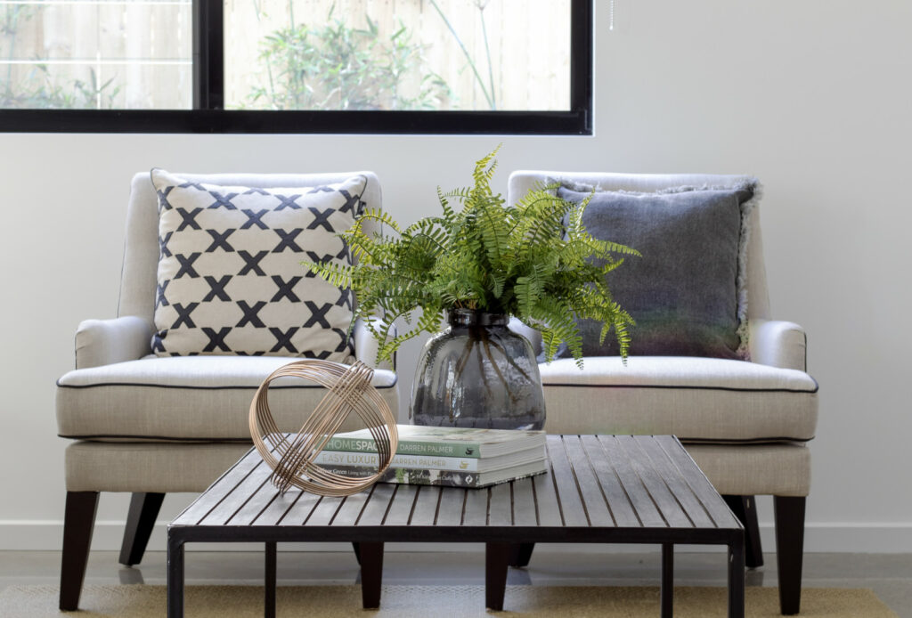
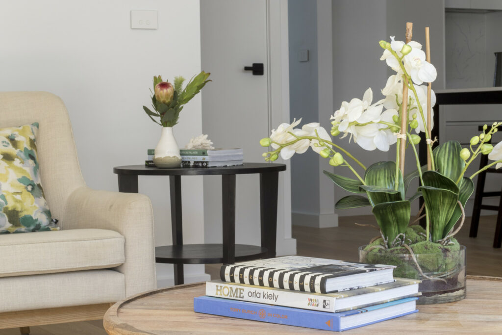
A coffee table purposes as so many things, make sure one of those things is a beautiful decorative addition to your living room! If you have been too scared to get creative, or have more of a dumping table, then a coffee table, check out these top tips to creating an eye-catching display for your space.

Like in so many areas of design in your home, the rule of three is so easy and effective in styling your coffee table. Here are some go-to items that you can use:
Books are a Base
Beautiful books or magazines stacked create a neat and orderly sense of structure to your design. Try stacking three books, that are roughly the same size, and stack from largest to smallest. This stack forms the perfect base for further styling.
Play with Shapes
While books add a nice structure, it creates a very rectangular look. Play with elegant curves of vases, bowls, candles, or anything to break up the sharpness. Circles paired with rectangles are a classic combination that add visual interest.
Experiment with Heights
The rule of three works perfectly here as well. Try achieving different heights by using items of different sizes or stacking. In groups of three you can also create pleasing symmetry or captivating intentional asymmetry. Playing with different heights makes you coffee table more dynamic and interesting.

Add Some Interest
Flowers and candles are two design elements that are fun to play with when experimenting with height. Flowers also add colour and life into the space, and candlesticks add some glamour and sophistication.
Bring In Some Life
Leafy planters, cute potted flowers or cactuses bring energy into the space – the introduction of organic lines against the manufactured accessories is the perfect contrast. For an easy rule of three combination, pair a plant, simple book, and a sleek metal or glass bauble.
What Coffee Table Do You Have?
Here is a cheat sheet for what looks great on different coffee tables:
- Square Table: try to avoid creating four perfectly symmetrical corners, choose two corners to add one piece to, or create a beautiful group of three in the centre.
- Glass Table: a see-through table demands an interesting graphic rug beneath it. Try decorating the table with similar accents to the rug, or leave it bear with all attention for the rug.
- Two-shelf Table: just because your table has a two shelves doesn’t mean you need to fill both. Experiment with two pairs instead of threes – add a basket or box to the lower level for stylish storage, and play with height on the top level.

Learn the 3 core frameworks all home stagers need to stand out in the crowd and attract their ideal clients!
Get the step by step in our free video class, CLICK HERE

 Naomi Findlay is an experienced interior designer, project manager and stylist who also loves sharing her passions and experience by teaching others.
Leave a Reply